Introduction
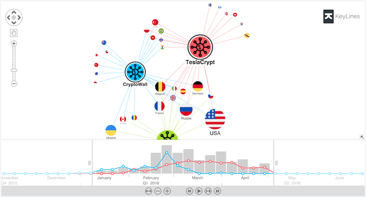
The KeyLines time bar lets users quickly spot how connected data evolves over time.
It offers powerful ways to filter data through events on both the chart and time bar:
- Chart-driven filtering: select the chart items of interest so the time bar shows
when they were involved in events.
- Time bar-driven filtering: focus on the time an event occurred so the chart shows
which items were involved.
The time bar supports both instantaneous events, such as the date and time of fraudulent
transactions as shown in the Credit Card Fraud demo, and
events that take place over a period of time with a start and/or end date/time, such as
the time a user logged in to a particular site.
For an example of time periods, see the Time Periods demo.
Key features
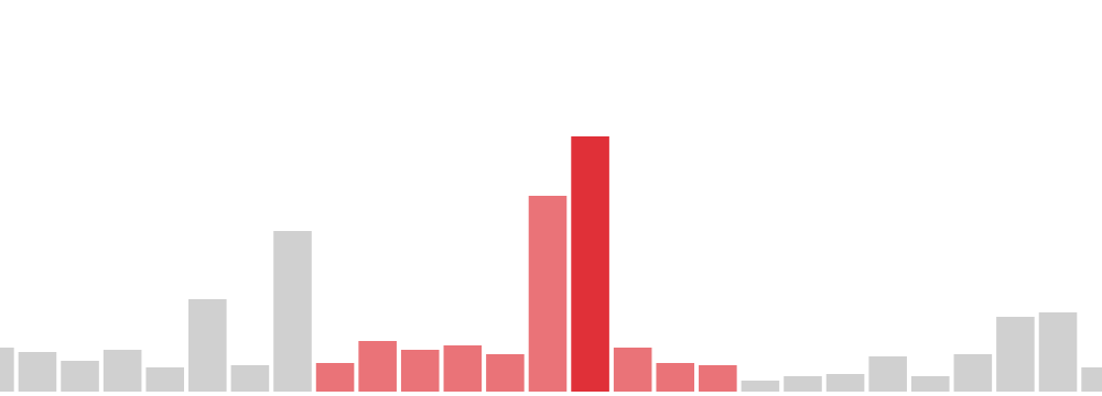
There are two ways that you can display data in the time bar:
Histogram
Each bar represents a period in time and is a cumulative count of all items within the range.
Selection lines do the same, but on a different (usually sub)set of data.
Histogram bars can also display groups of data within them as a set of stacked bars.
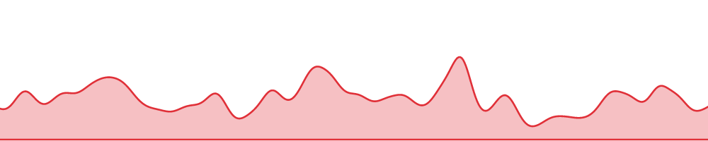
Area Plot
Events and durations are represented as a distribution, with the value trailing off to each side.
The height of the area at each point is a total of these distribution values,
which creates a smooth shaded area.
As events are discrete, the height of the line only represents an estimate of the value at each
point in time. The area under the curve will be filled.
Selection lines
Selection lines also count items within a range, and provide a useful way to highlight
certain subsets of your data. To maintain clarity, selection lines use a different scale to
the full data, to prevent them appearing too small.
However, the scale of each selection line is the same as for other selection lines,
as this enables direct comparison.
Dynamic Animation
The time bar can play through time to let you see how your data evolves. Other intuitive
navigation controls let you move back and forth or zoom in and out easily.
Sliders
Dragging left and right sliders changes the time scale or selects a specific point in time.
You can use these to focus on important data, or get a broad view of a larger period.

Try out these features for yourself in our Time bar demos.
You can customise any aspect of the time bar, from the time scales or day/month names to the colour schemes used.
KeyLines also supports:
- local time and UTC time - KeyLines displays the literal date and time defined in your code.
You can choose to support the UTC recorded on a user’s server, or their local time zone.
For more information, see the Time Zones documentation.
- multiple time bars - this lets you show time scales at different levels of granularity for the same chart.
For more information, see the Multiple Time Bars demo.
- integration with maps - the time bar works with a chart when integrating with Leaflet to provide advanced geo and time-based analysis.
Getting time-based data into KeyLines
The time bar and chart are independent of one another. Once you’ve loaded data into the chart,
use the time bar object to load the same JSON data into the time bar:
const data = {
  items: [
    { id: 'id1',  // 'id1' is the identity that the item relates to
      dt: [...],  // a time entry or array of time entries - Date objects or numbers,
                  // or a TimePeriod object
      v:  [...],  // an optional value or array of values for each time entry
                  // values must be numbers, there must be one for each time entry
    },
    { id: 'id2',
      dt: [...],
      v:  [...]
    },
    ...
  ]
};

timebar.load(data).then(() => {
  return timebar.zoom('fit', { animate: false });
});
The time bar object's
dt property is a JavaScript date object or
millisecond number. It can also be a time period
object with dt1 and/or
dt2 properties representing the start
and/or end of the time period.
The v (value) property adds useful details. For
example, in a financial investigation you could use it to show the
total transaction value at certain times.
Connecting chart and time bar data
You can attach any chart event to the time bar:
For the chart to update whenever the time bar range changes, you need to listen for the time bar change event and filter the chart.
Use:
// When the time bar range changes
timebar.on('change', async () => {
  // filter the chart to show only items in the new range
  await chart.filter(timebar.inRange, { animate: false, type: 'link' });
  // and then adjust the chart's layout
  chart.layout('organic', { mode: 'adaptive', animate: true, time: 1000 });
});
For the time bar to show a selection line that represents items selected on the chart, you need to listen for the chart selection-change event.
Use:
chart.on('selection-change', () => {
  timebar.selection({ id: chart.selection() });
});