Chart Basics
Contents
Introduction
A chart, also called a graph, is a visual way to show data. This data can describe physical entities, such as people, vehicles or servers, or abstract entities, such as countries or accounts. Charts are widely used as an analysis tool in many fields including cyber security, fraud detection, intelligence or law enforcement.
KeyLines charts use nodes, links and other items and features to visualise data and reveal relationships, patterns and anomalies.
Key features
The basic building blocks of a chart in KeyLines are nodes, representing concrete or abstract entities, and links, representing the connections between them.
Alongside these, KeyLines offers many more features that make charts interactive and fully customisable. These include for example:
- Layouts that untangle complex relationships in the data and turn them into easily understandable visual patterns.
- Node styling and link styling options that enrich nodes and links with more contextual information from the data.
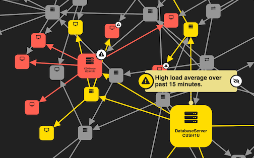
- Annotations that can visualise important insights and alerts and tell the story behind the dataset.
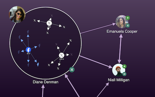
- Combos and aggregate links which organise nodes and links to reduce visual clutter at a first glance.
- Event logging that handles any user interaction with the chart or time bar.
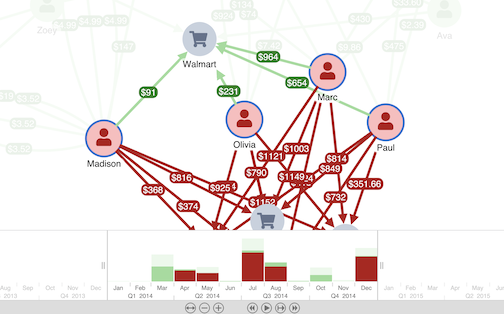
- Time bar that allows you to visualise, explore and filter data that evolves over time.
You can explore all of these features in our demos.
Creating charts
To create a chart, call the KeyLines.create() function that creates a KeyLines container for the chart component to sit inside:
async function startKeyLines() {    // async functions prevent long-running functions from blocking
  chart = await KeyLines.create({   // waits until chart is created before calling other functions
    type: 'chart',
    container: 'kl',
  });
  chart.load(data);
}
You must wait for KeyLines.create() to finish
before calling other chart functions
such as chart.load().
See
Asynchronous JavaScript
for more details.
You can display multiple charts on one page, as shown in the Path Analysis in Trees demo.
Loading data
KeyLines is database agnostic and works with data from any source, but it only accepts data in JSON format.
There are a few different ways how to load data into your chart. See Loading Data for more details.
Customising charts

Styling items
Chart items including nodes, links and annotations can be styled and enhanced with various sub-items for decoration or additional source of information.
You can add styling directly in the items array:
let data = {
  type: 'LinkChart',
  items: [
    {
      id: 'node1',
      type: 'node',
      c: 'green',                   // green node background
      t: { t: 'A simple label' },   // a label as a node sub-item
    }
  ],
};
Or if your data is already loaded into the chart, you can use chart.setProperties() or chart.animateProperties() to change the properties of items in the chart:
// updates the node background and label text
chart.setProperties({ id: 'n1', c: 'orange', t: { t: 'A different label' } });
For various examples, see:
- Nodes: Node Styles demo, Advanced Node Styles demo and Node and Combo Styling documentation
- Links: Style Links demo and Link Styling documentation
- Annotations: Annotations Basics demo, Advanced Annotation Styles demo and Annotations documentation
To help accelerate the design and build of branded graph visualisations
that fit seamlessly into your application UI, download our free
Figma Design Kit.
Chart options
The chart options APIs can be used to change styling, display and interaction defaults of the chart as an element that integrates into an application.
You can set options in the KeyLines.create() function:
const options = { controlTheme: 'dark' };

chart = await KeyLines.create({
  ...
  options,
});
Or you can apply options by calling chart.options() function as a setter:
const options = { controlTheme: 'dark' };
chart.options(options);
For a full list, head to the chart options APIs, including for example:
- Background: background colour or background gradient
- Branding: logo or watermark
- Navigation: navigation controls, overview window or dark theme for navigation and overview controls
Chart functions
The chart functions have many uses including adding and removing chart content, manipulating the view, running layouts and more.
These functions are called on the chart object created by KeyLines.create():
const chart = await KeyLines.create({ type: 'chart', container: 'kl' });  // creates a chart in 'kl' div
await chart.load(data);
await chart.layout();
For a full list, head to the chart functions APIs, including for example: